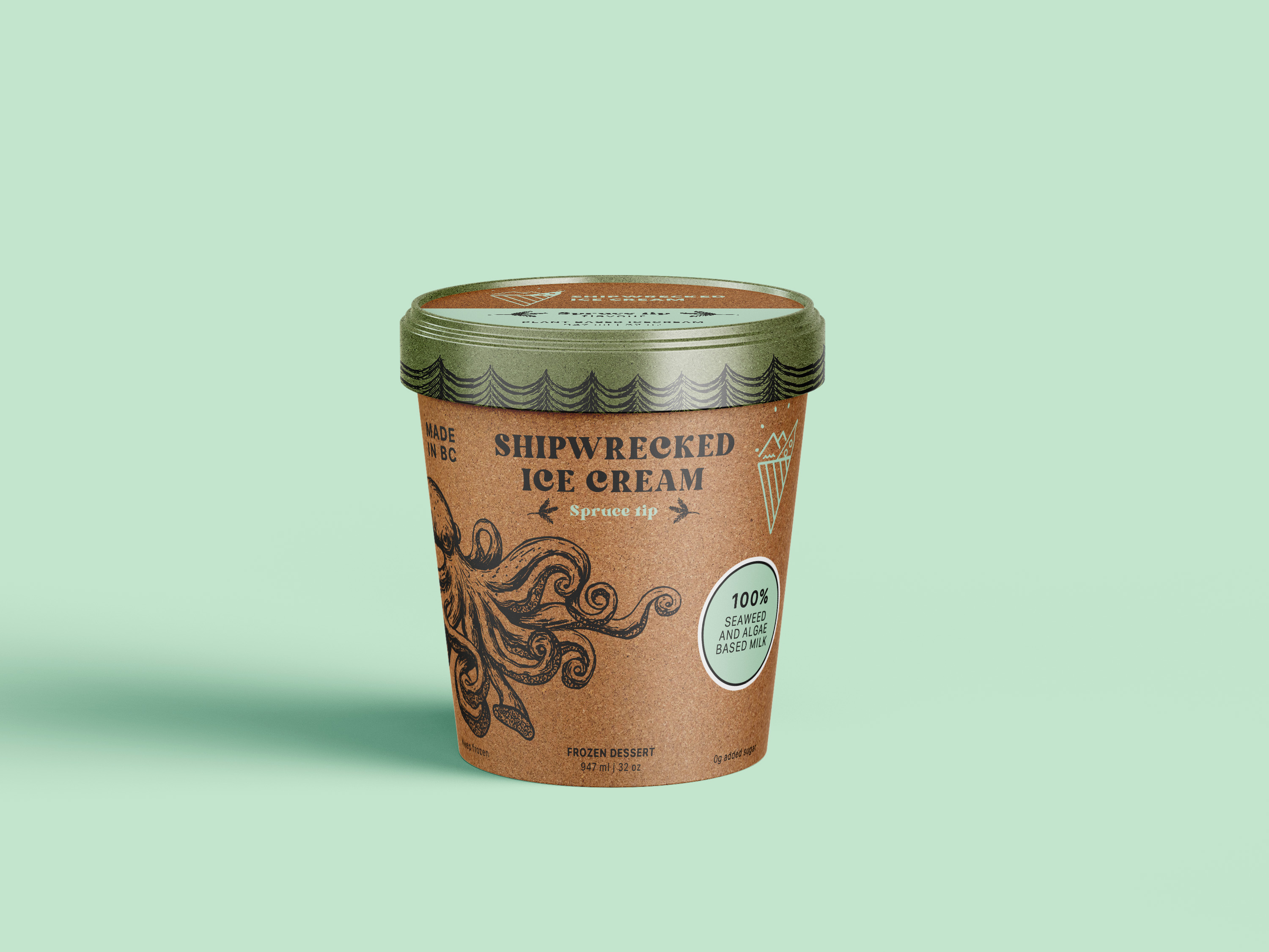
Shipwrecked Ice Cream needed a packaging and brand experience that stood out from generic ice cream brands while celebrating BC’s Indigenous and sustainable coastal ingredients. They wanted to appeal to adventurous foodies without compromising on eco-values or authenticity.
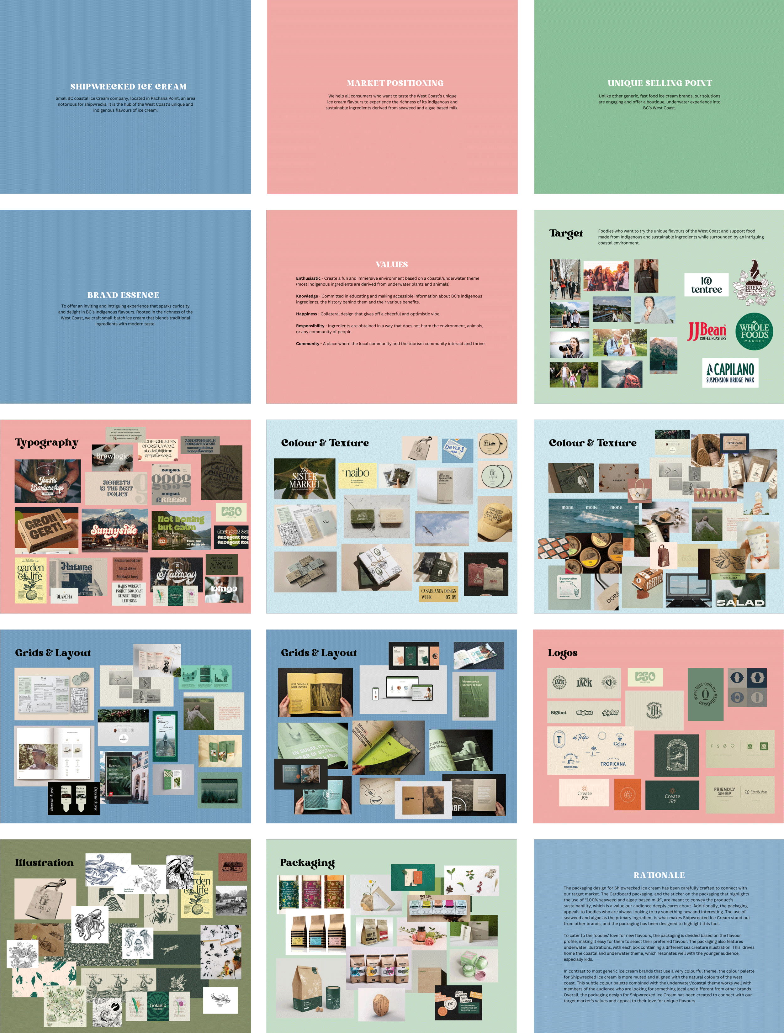
I researched BC’s coastal identity, indigenous ingredients, and eco-conscious consumer behaviour to guide the brand’s visual and packaging direction. The strategy focused on creating an immersive, boutique experience that highlights sustainability and flavour exploration. This led to an eco-friendly packaging system with flavour-based organization, a muted coastal palette, and sea creature illustrations. This engages foodies and families while showcasing the product’s USP, seaweed and algae-based milk.
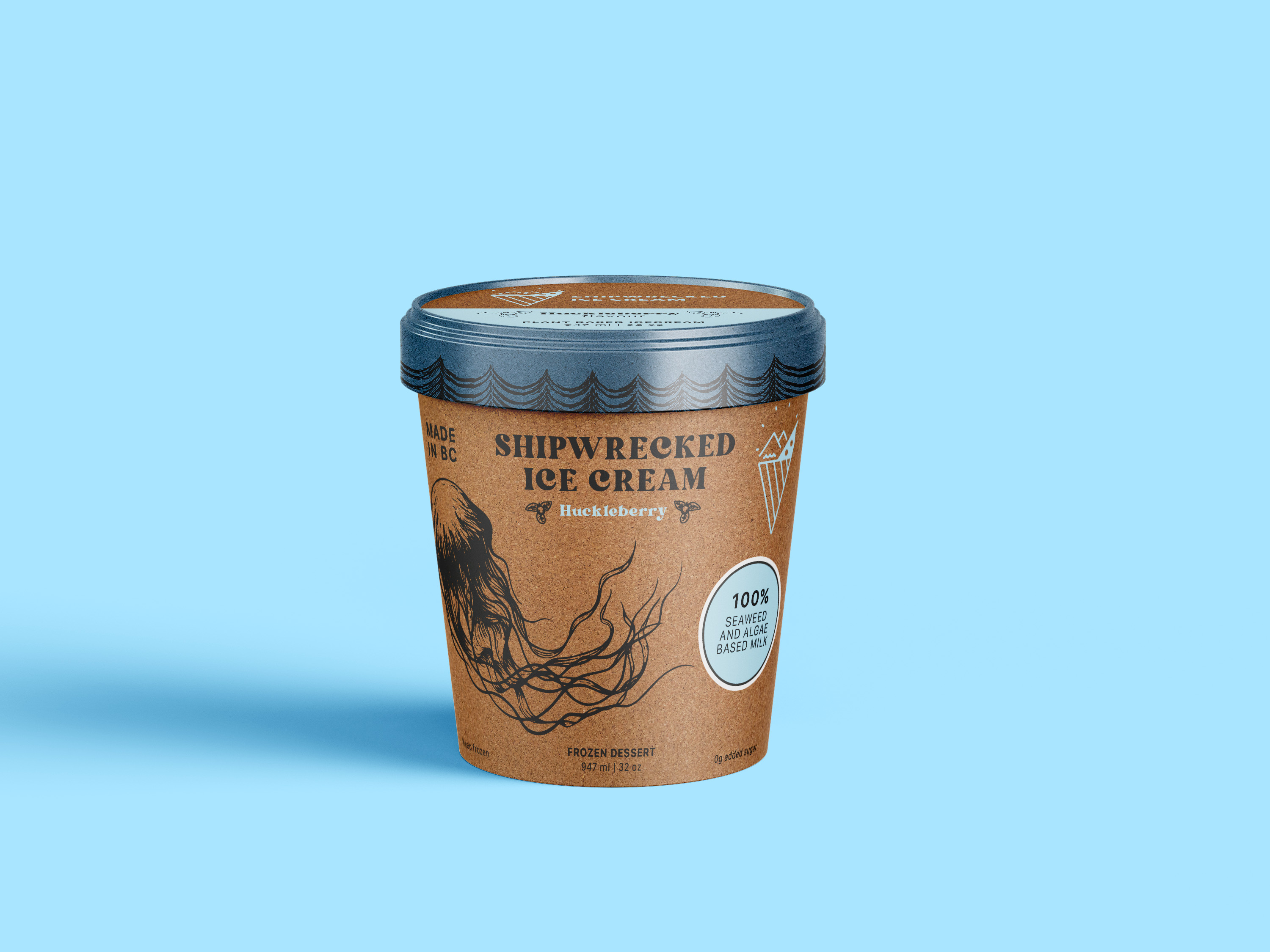
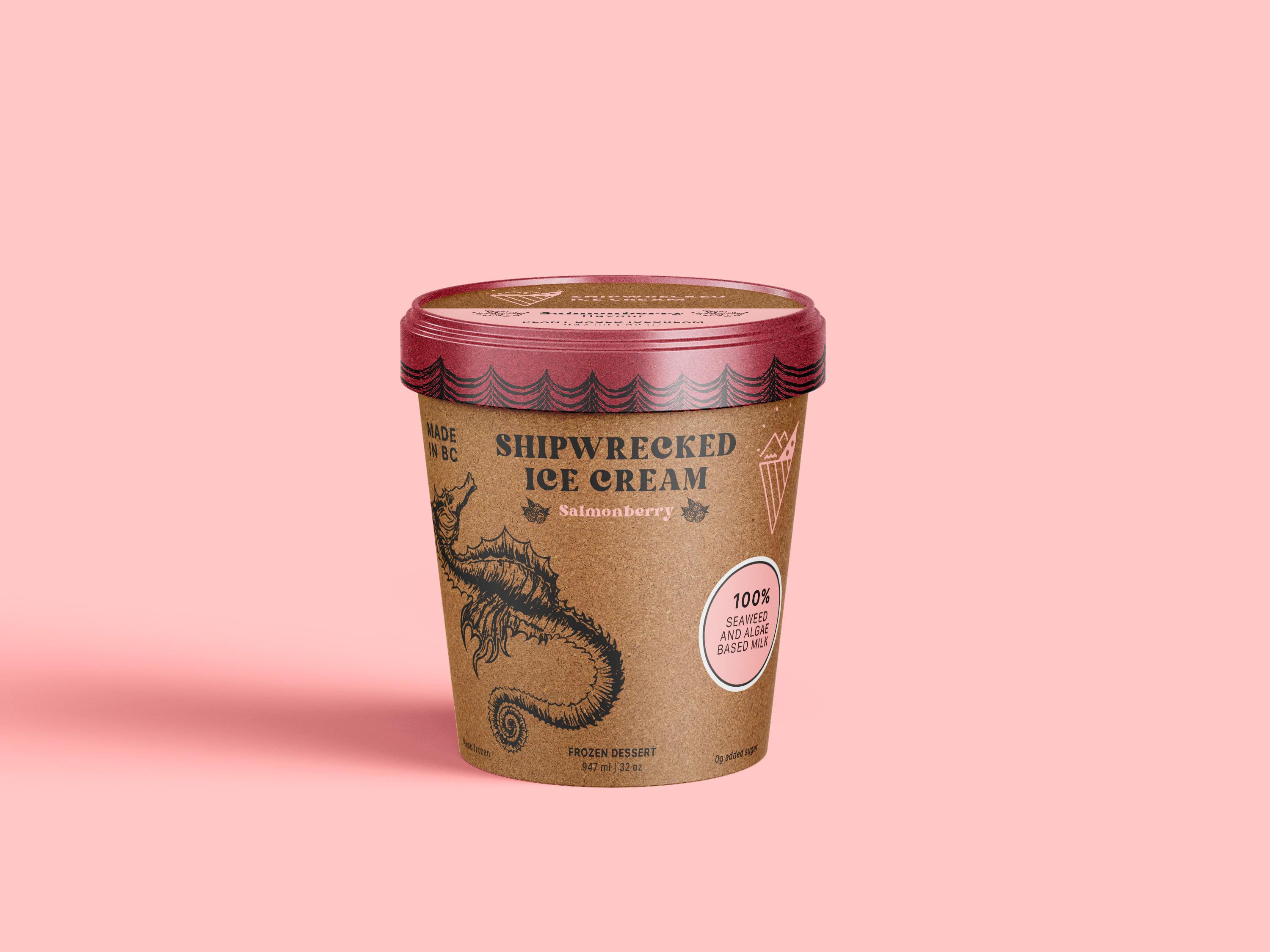
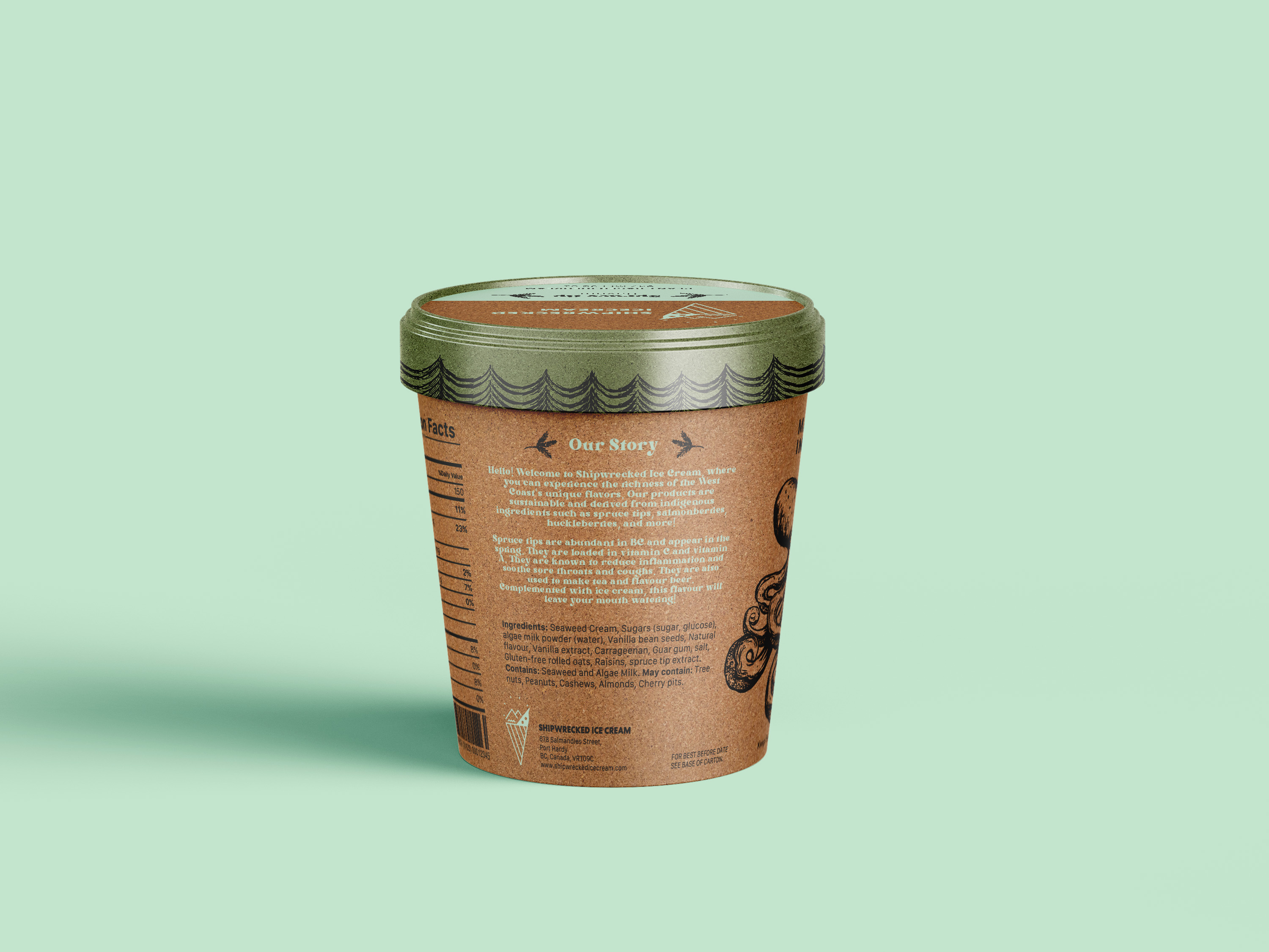
The back of each package includes a short story about the flavour’s origin and natural properties (ex: spruce tip’s healing benefits), deepening the connection to the land and inviting curiosity with every scoop.
The moodboard features coastal colours, hand-drawn marine life, and textures inspired by driftwood, ocean currents, and seaweed. These visuals mirror the raw beauty of the BC coastline and supports the brand’s narrative of sustainability and exploration.