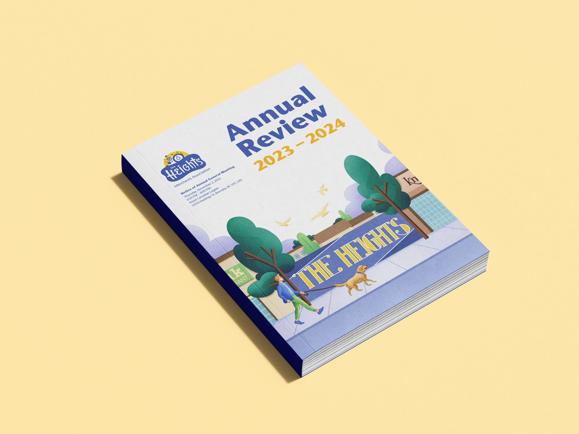
Readers had largely ignored previous reviews, reading them felt more like a chore than a celebration of Burnaby Heights. The reviews failed to reflect the vibrant spirit of the community or highlight the various events hosted by the Heights BIA.
Incorporate illustrations that capture the lively nature of the Heights neighbourhood while enhancing the use of brand colours. Combining this with variety in the layouts resulted in a much more appealing annual review.
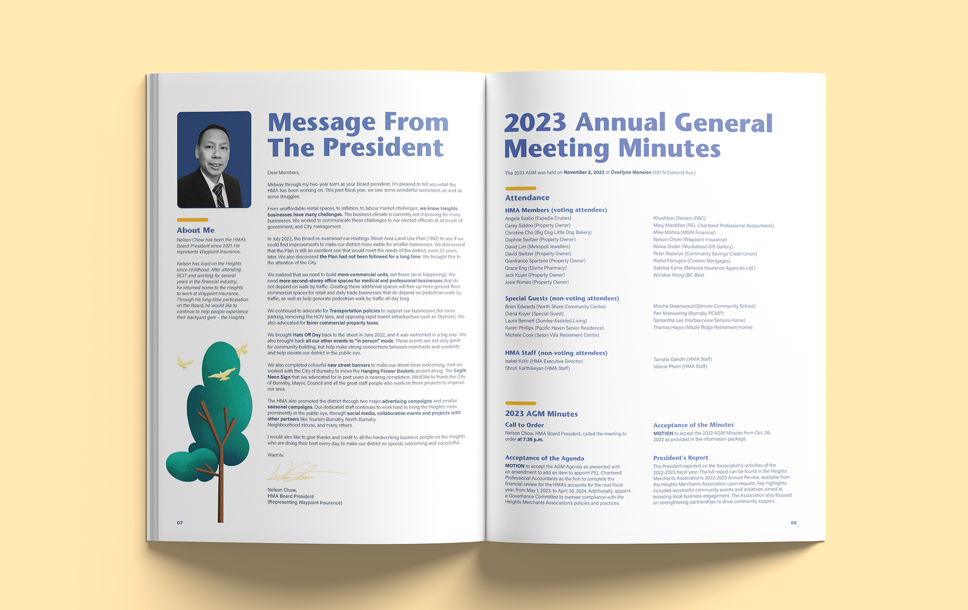
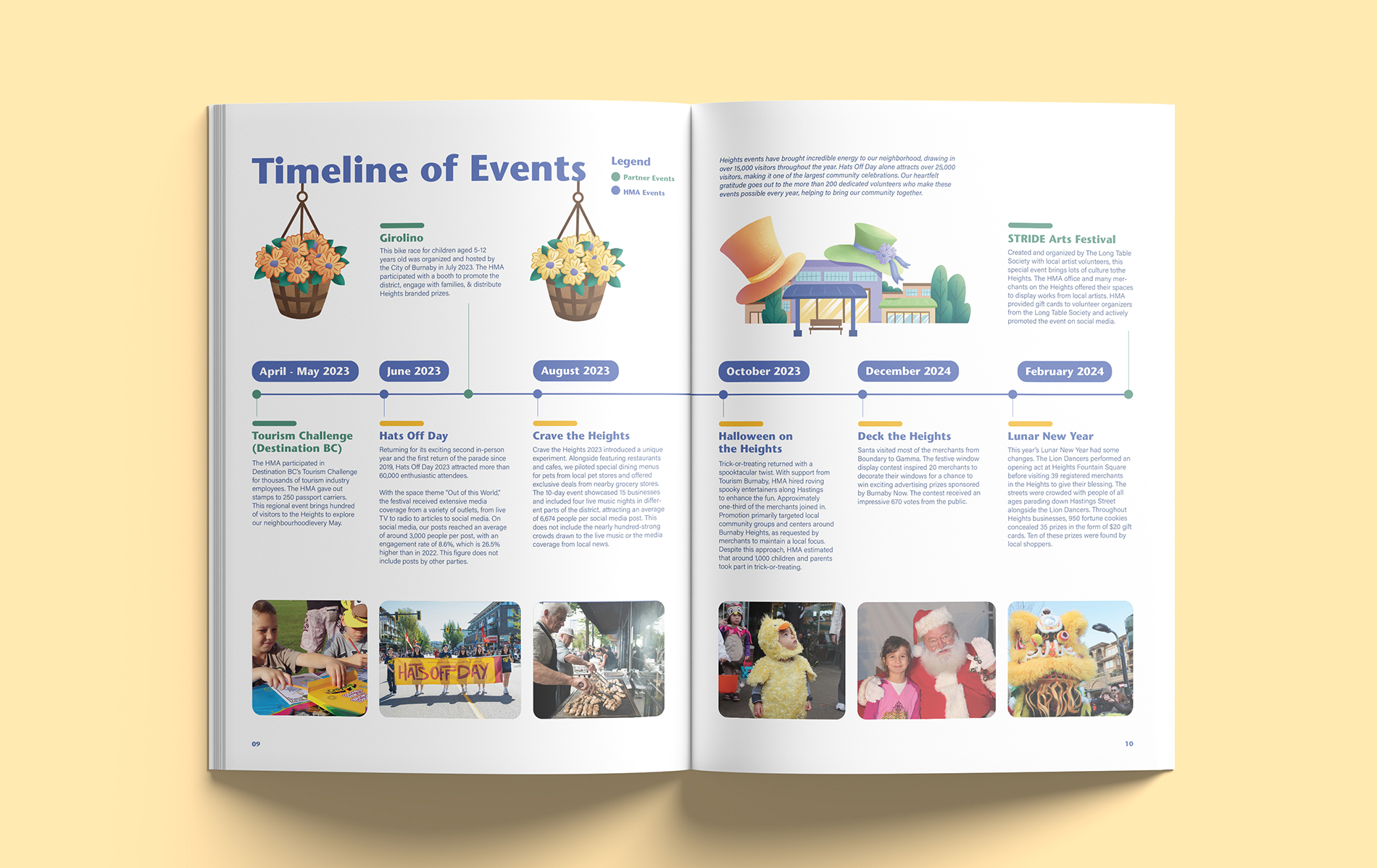
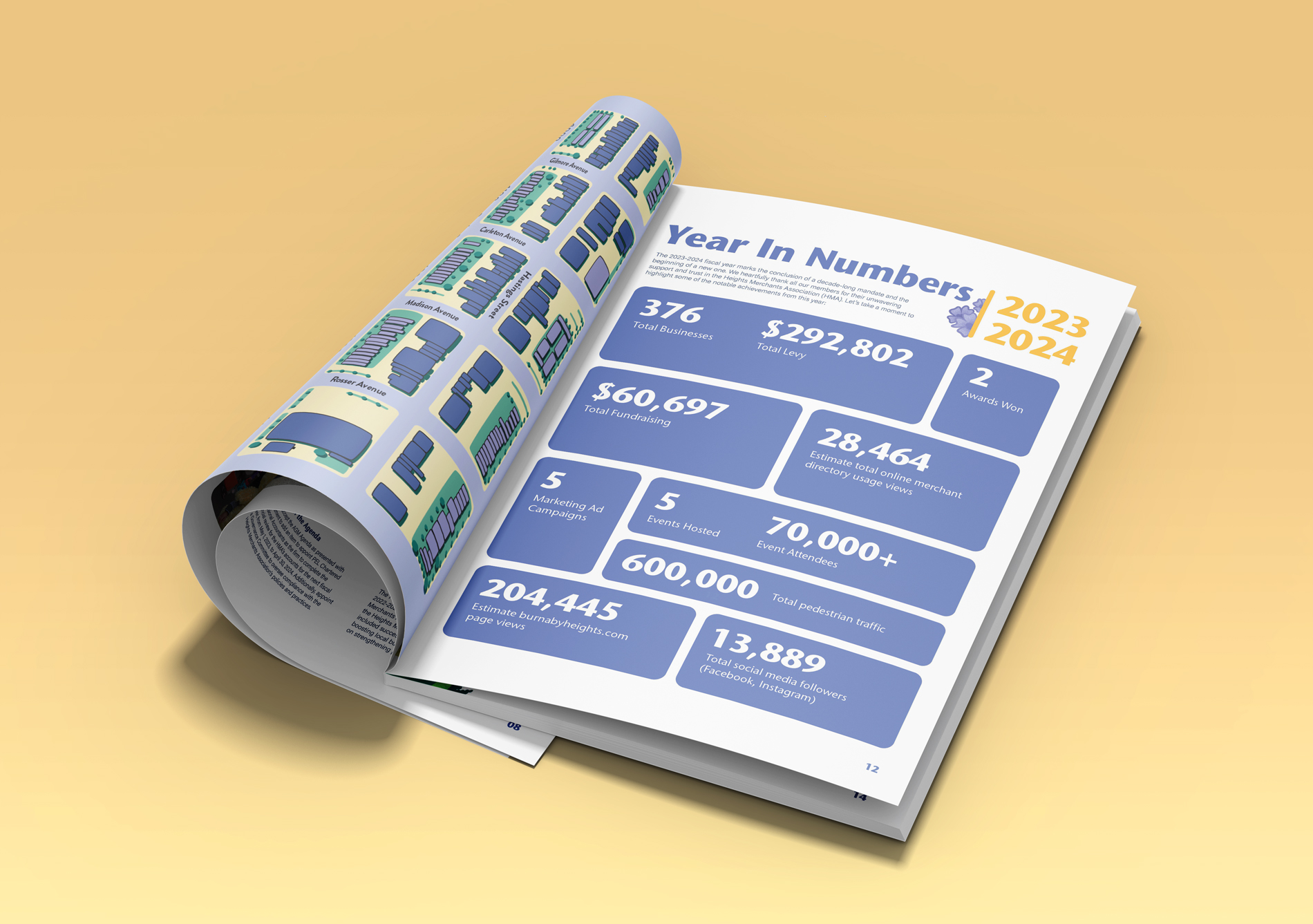
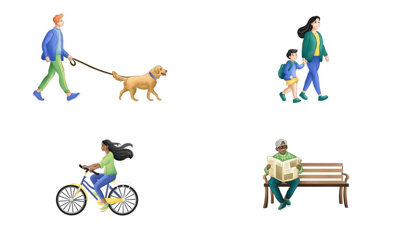
The focus was on capturing the spirit of everyday life in the Heights through illustrations such as an elderly person reading the paper on a bench, flowers sprouting in the spring, the sun's warmth, and a mom walking her child to school.
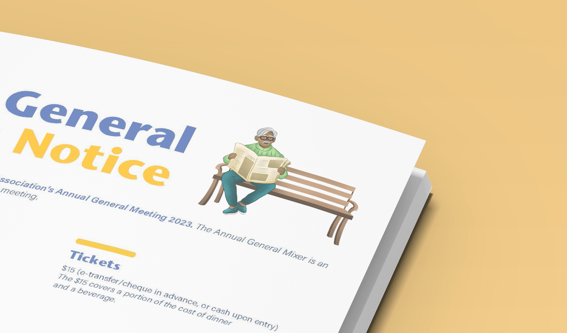
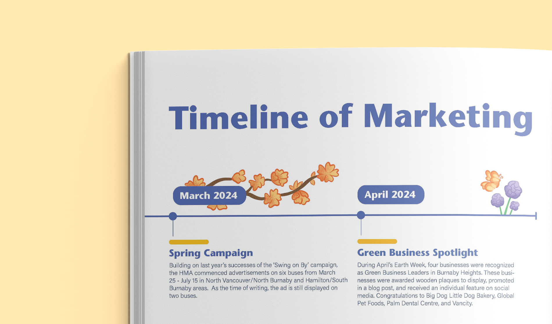
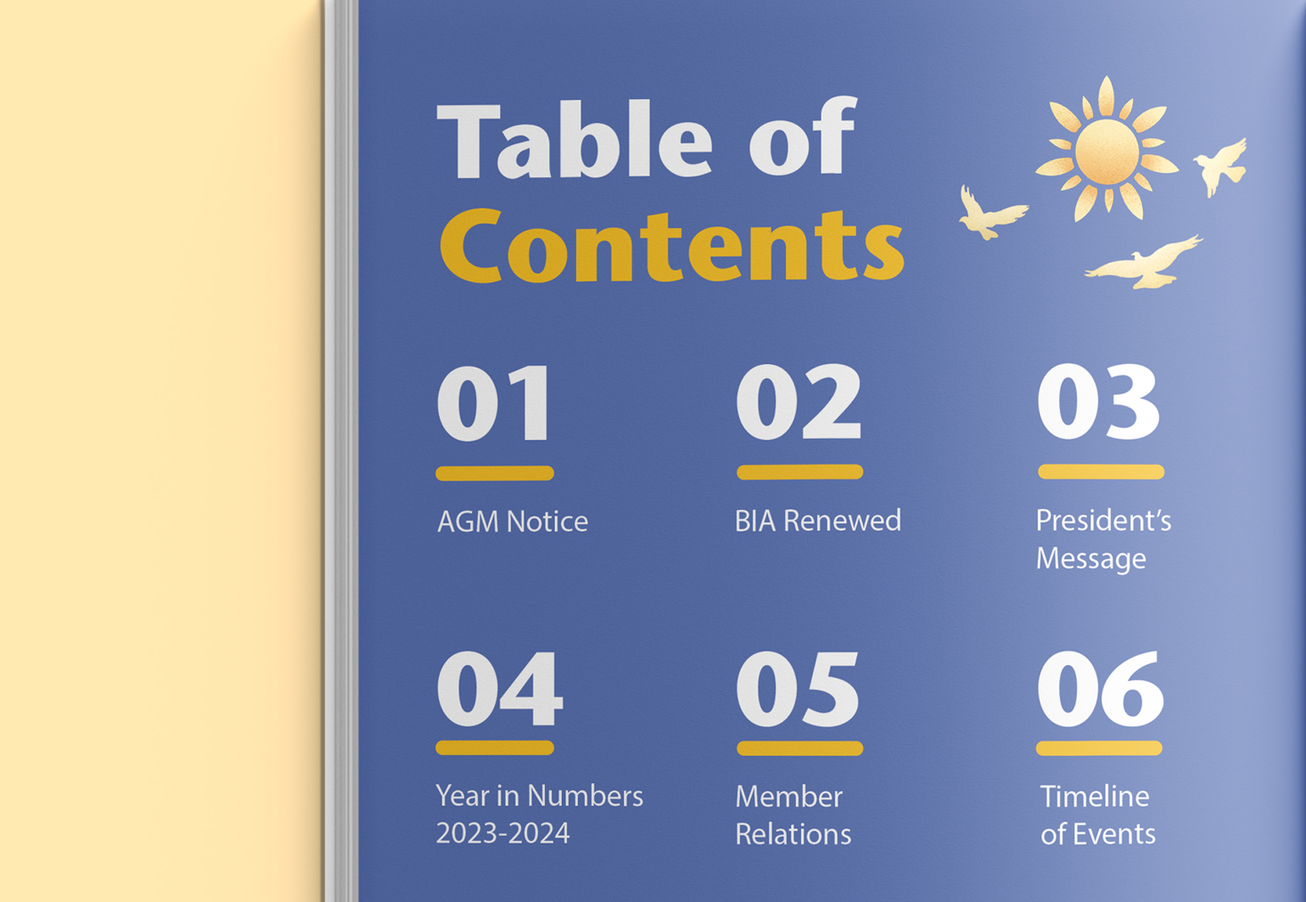

I was tasked with creating illustrations that could be versatile enough for future Heights ad campaigns, billboards, and bus ads. A variety of characters and neighbourhood buildings were designed, not only for the annual review but also to enhance presentation decks and slides at the AGM.
Like what you see?
shrutikarthikeyan.creative@gmail.com© Shruti Karthikeyan 2025. All Rights Reserved.